Get inspired for your next project with these five on-trend paint shades.
Before you pick up a paintbrush, discover what colours the most stylish walls are wearing. Paint is one of the most cost-effective ways to transform a room and it’s been in demand more than ever since our first lockdown back in early 2020.
Sales trends show we’ve saved on holidays and high heels and spent on our homes – so much so that some home decor brands, both here and overseas, have reported huge increases in sales.
Resene colour expert Becca Long tells Woman that Kiwi homeowners have become much more courageous with colour.
“Confidence is definitely growing when it comes to darker, bolder shades, and it makes me so excited to see people wanting to explore these colours more,” she says.
If you’re planning on giving your walls a new coat of colour, here are five on-trend shades to have on your radar.
The friendly green
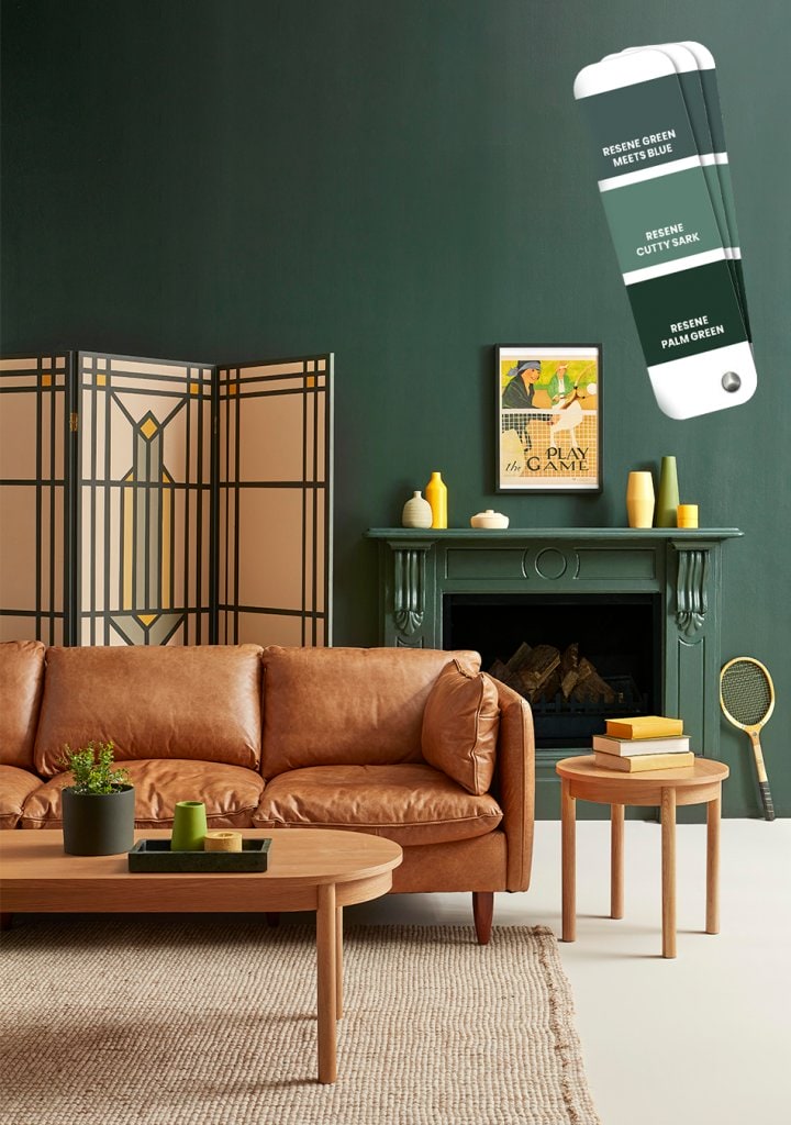
Green has been dubbed the paint colour of lockdown as people have sought to bring the outside in via the shades of nature. Last year, sales of green paint were up 32% at British home improvement retailer B&Q, and brands across the board – both in New Zealand and around the world – are reporting strong demand for grassy greens.
Becca’s favourite is Resene Family Tree, part of Resene’s fashion colour range, which she says brings “a touch of nature indoors”.
“Green walls offer such a lovely connection with the outdoors, especially for these cooler months when we’re spending much of our time inside at home,” she says. “It adds to that feeling of cosiness and cocooning.”
Her advice is to mix a bold tone such as this with other colours and patterns. “Look to nature for inspiration,” she suggests. “Rich timber floors, wooden furniture and natural fibres all go wonderfully with greens.”
The glamorous navy
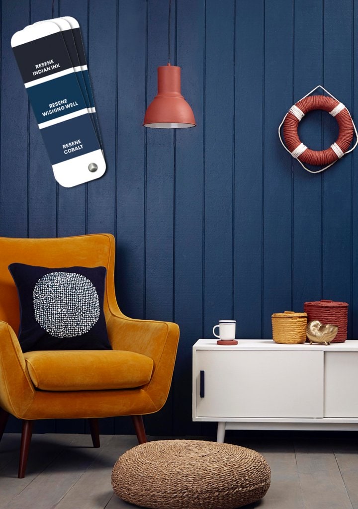
Inky blue has overtaken charcoal grey as the chic way to do dark interiors. Resene Wishing Well is a popular choice for a bright navy, or for those looking for a deeper hue, Resene Indian Ink is another stunning option.
“Navy blue adds a layer of sophistication to any room,” Becca says. “It can be quite a brooding, cosy colour, but it’s also quite regal, adding a touch of glamour.”
A dark blue room is wonderful in dim lighting, she adds, so it makes for the ultimate night-time setting.
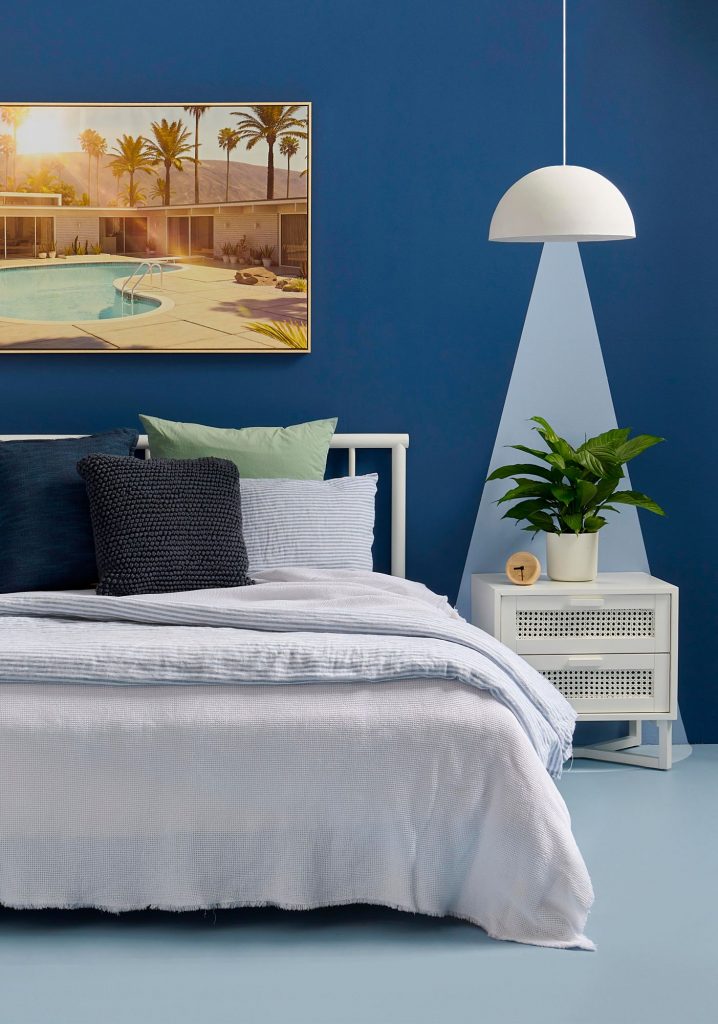
“A deep blue master bedroom can be pretty special,” she says. “But it also works well in small spaces, such as a study or a home office, where you want to be able to focus.”
The go-to white
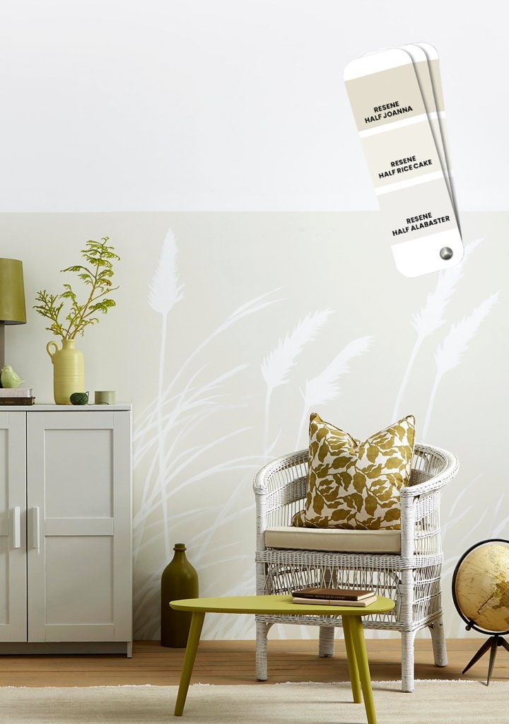
Choosing a shade of white paint from he thousands on offer can be a bewildering task. Becca’s go-to whites are Resene Half White Pointer and Resene Merino. “They’re both quite complex whites, but they both offer a fresh look without being too stark. They provide a subtle warmth without the yellow undertones of some of the warmer whites,” she explains.
While Resene Alabaster has topped the charts as Resene’s top-selling white for many years, recent trends have shown an increasing preference for shades with warmer undertones.
“It was all about crisp whites and steely greys, but now there’s a move towards having more warmth and comfort in our homes. People are craving that more than ever and it’s reflected in our paint colours.”
The perfect pink
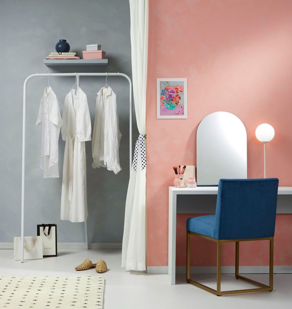
Pink is a colour associated with optimism, so it’s no surprise it’s gone from strength to strength over the past year – so much so that blush pink has become the new neutral for walls. Finding the right, not-too-sickly shade can be a struggle, however, which explains why the soft tones of millennial pink have been a hot favourite (as pictured above).
For a more grown-up shade, Becca suggests pinks with grey or smokey undertones. Resene Irresistible is a fun choice with its darker magenta hue.
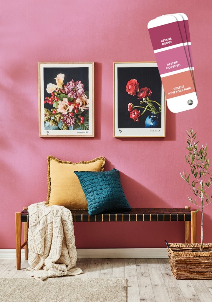
“Resene Love Me Do is another lovely pink,” she says, pointing out that the colour is no longer reserved for girls’ bedrooms or children’s playrooms. “Pink is a fantastic colour for any room,” she says. “It’s playful, beautiful and so full of optimism, which we all need right now.”
The rich red
Deep burgundy and red tones have been on the rise of late, particularly when paired with pale pink and off-whites, says Becca. Again, she says there’s been a trend towards colours that reference nature. “Paired with the forest green, a deep red evokes the idea of autumn leaves or winter berries.”
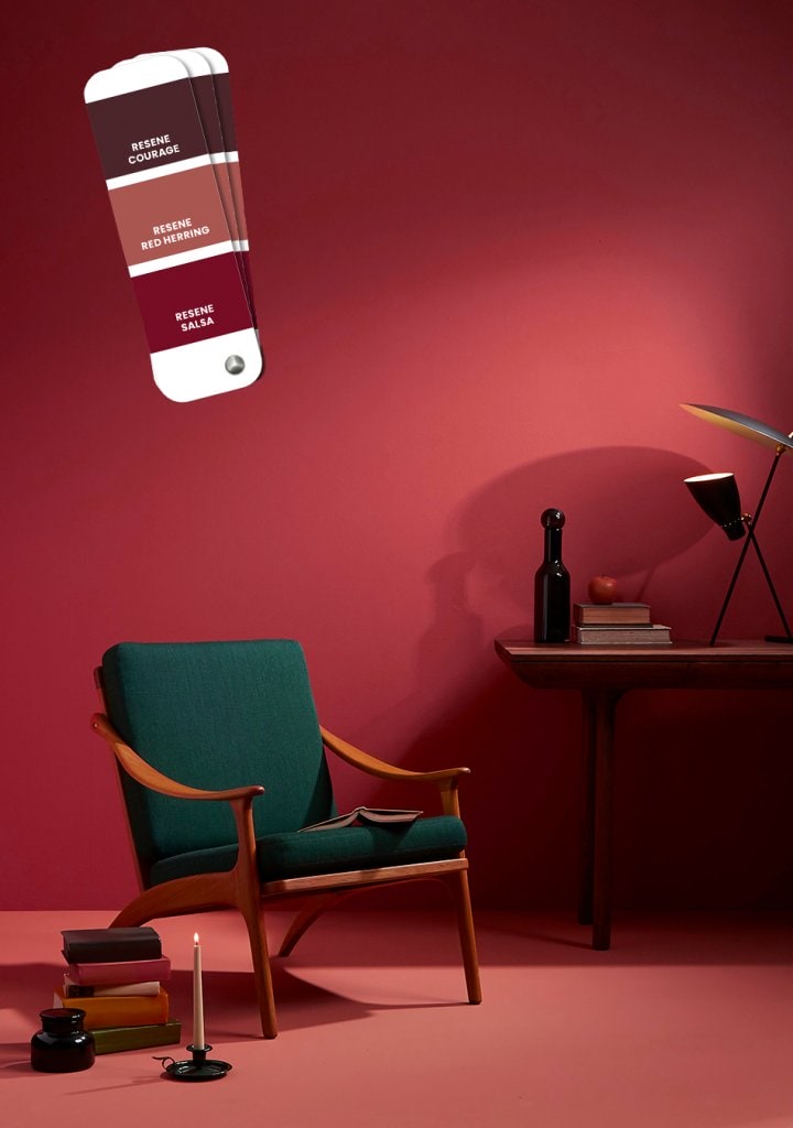
Rich reds look particularly smart in a dining room, where the shade adds a touch of luxury. “It’s not something you’d put into every space, but for one special room it can make a wonderful impact. And at this time of year, that richness can bring a cosy, warming atmosphere to the home.”