We’re moving swiftly on from monochrome as the energy, interest and vitality added to living rooms by a bold and confident use of bright colour emerges as one of the biggest design trends. And it is Spring after all!
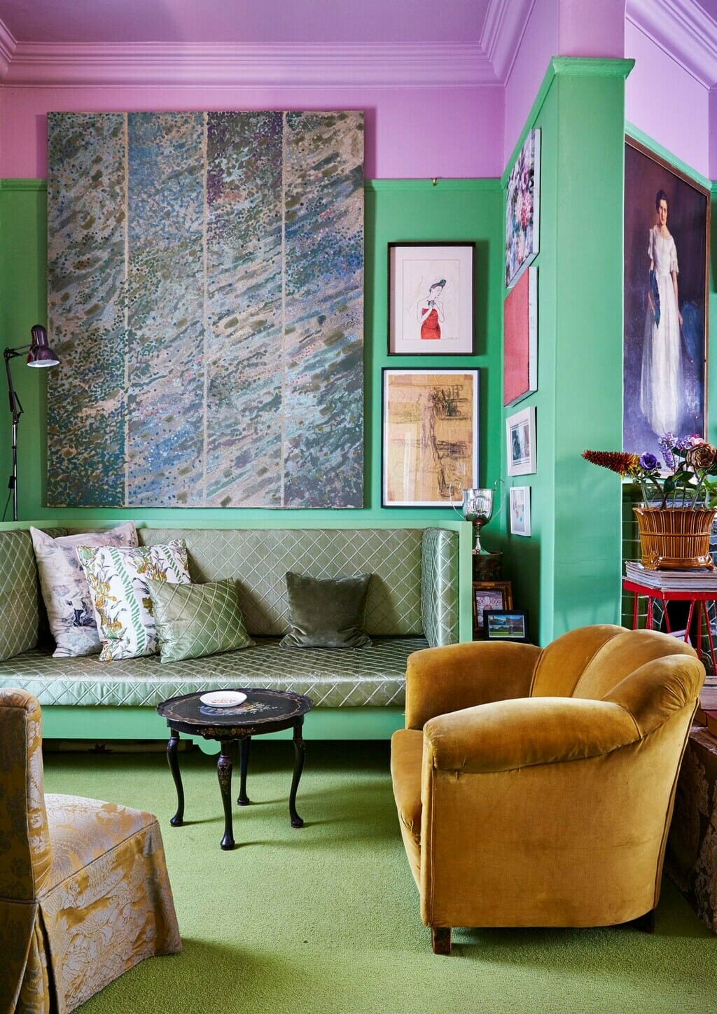
Into the Pink
A museum curator’s jewellery box of an apartment is a joyful explosion of contrasting colours that has been lifting its owner’s mood for more than two decades. In the living room, apple-green walls complement a bright pink ceiling, with a mustard-yellow velvet armchair setting off both shades to perfection. Finding the exact colour tones that the homeowner wanted to use in the various spaces was a challenge, and he made use of a colour specialist to assist with the task of tracking down the perfect shades.
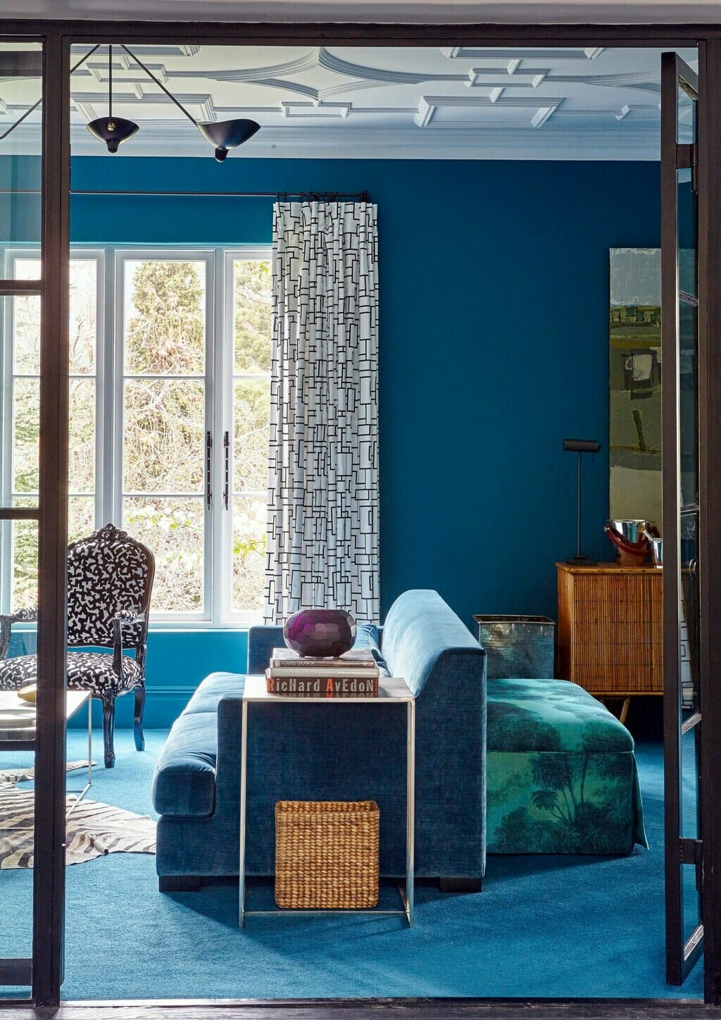
Blue Note
“I love colour,” says the owner of this large family home, in which each room sports a different but equally strong hue. “It’s about mixing and layering and not making it obvious and predictable,” she adds – and the confident combination of bold colours with black-and-white plus animal print makes for a lively and sophisticated feel throughout, as demonstrated in this supremely smart living room.
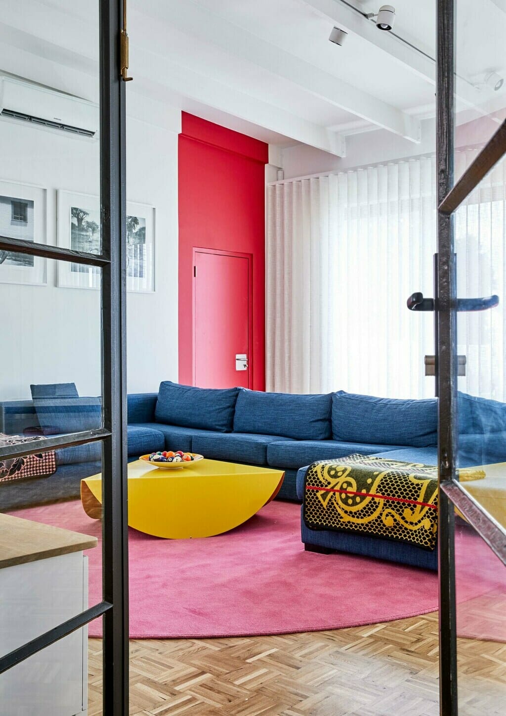
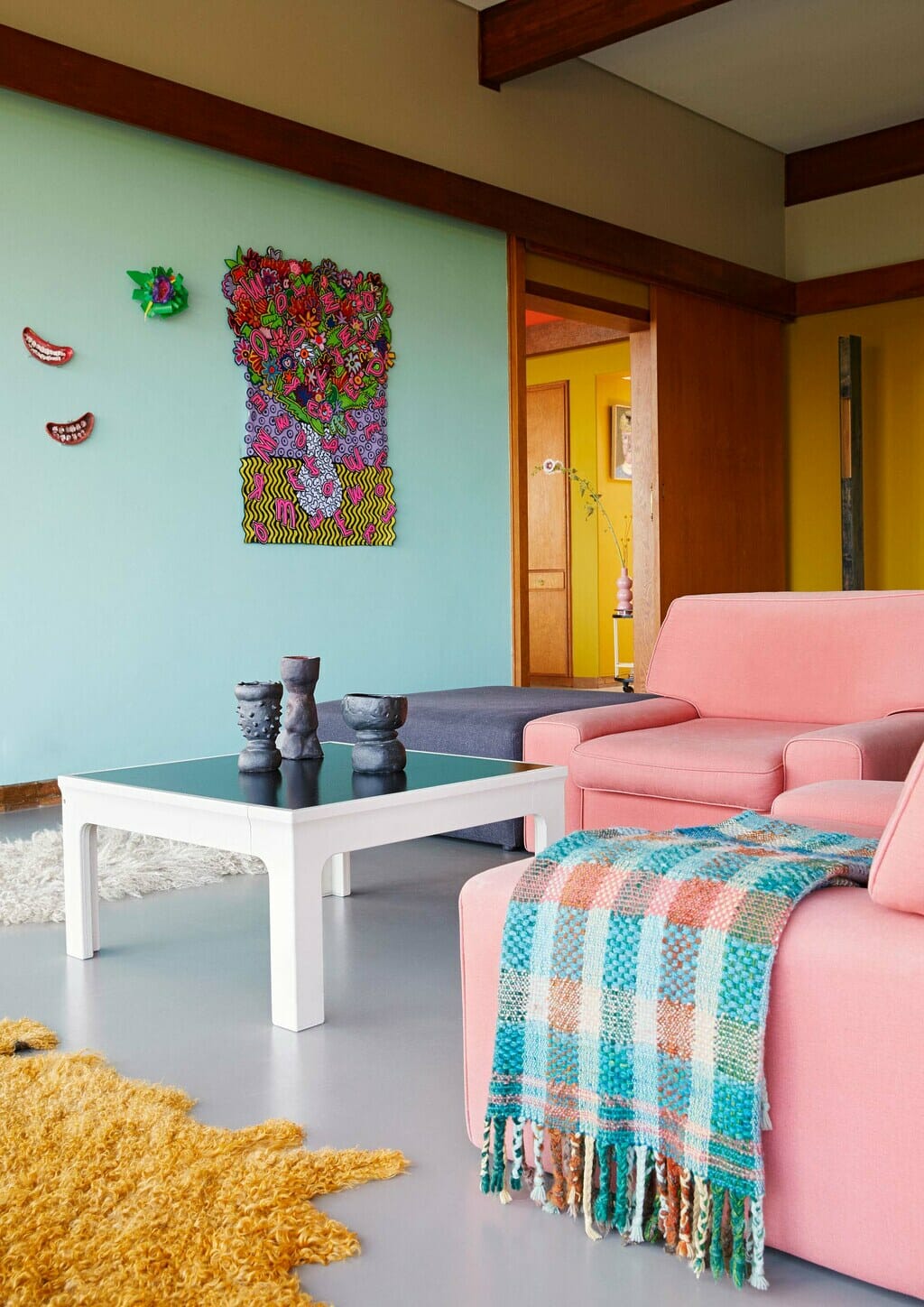
Jewel Tones
A contemporary jewellery designer’s home is, like her wearable creations, bold and exuberant in its use of colour. “I’m not afraid of mixing shades together,” she says, “but you have to be deliberate about it to pull it off.” In the living room, she’s done just that, combining pillar-box red, dark denim blue, fuchsia and yellow with real flair to create a mix that makes for a fun, energising and effortlessly multi-generational living room.
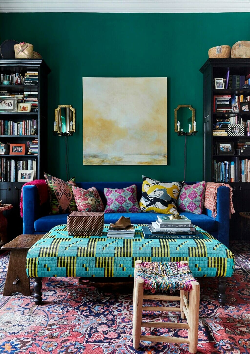
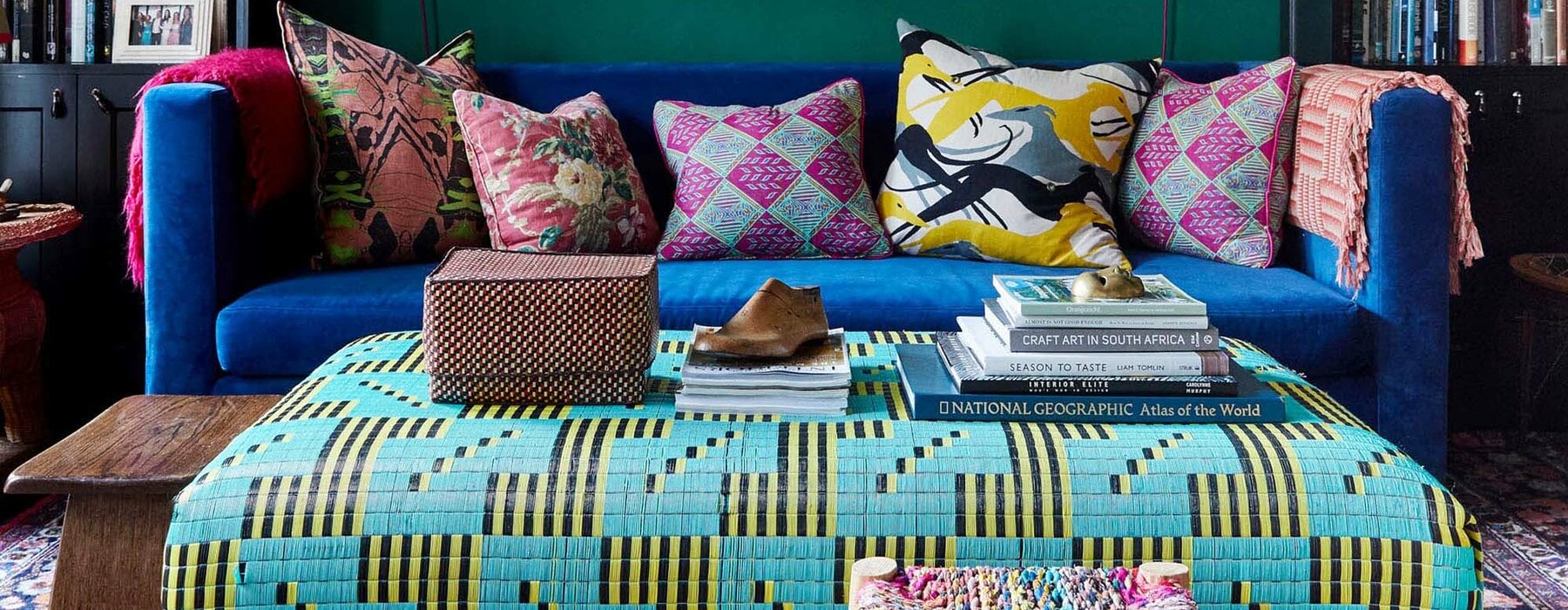
Emerald City
Well-known for her superbly gutsy approach to colour, the interior-designer owner of this suburban family home simply adores a bold hue. “Once I start, I can’t stop,” she smiles. “White just looks blah.” A plethora of patterns and textures – from the cane armchair and velvet sofa to the Senegalese plastic mat used to cover the ottoman – both complement and set off the bold green and blue hues used in her living room.
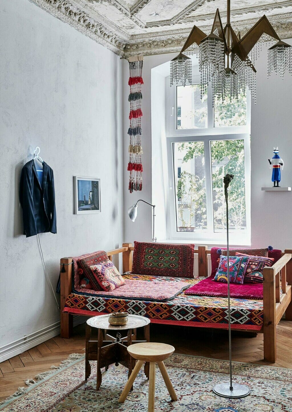
Culture Club
Mixing multiple patterns and colours judiciously isn’t always easy, but when done well – as seen in this apartment, owned by two artists – it is irresistibly attractive. A particularly important element in this living area is the inviting takht or “river-bed” that, strewn with colourful pillows and bolsters, is a vernacular piece of furniture commonly found in teahouses and at roadside kiosks, shrines, entrances to mosques and restaurants across Iran, the Caucasus and Central Asia.
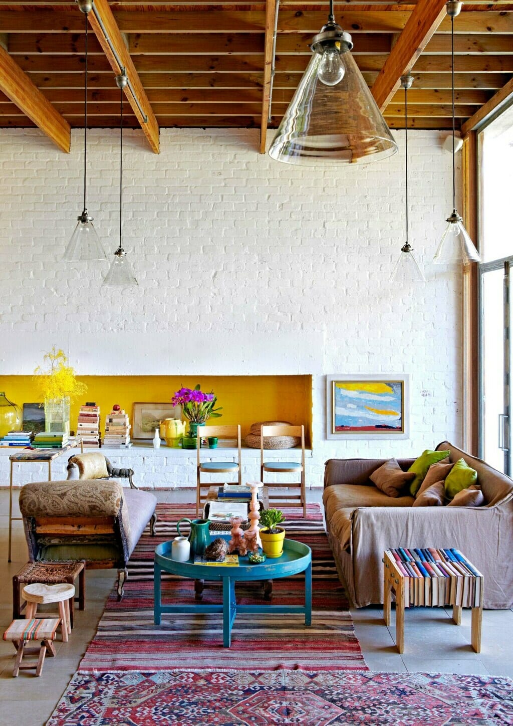
Pop Stars
It’s a truism that those not confident enough to deploy swathes of colour should instead add “pops” of it, ideally against a monochrome backdrop, but doing so can also make a space slide into the realm of decorating cliché. The chain hotel décor look has been resolutely avoided in this living room, however, where multiple colourful elements – including the golden-yellow display recess, turquoise-blue side table and colourful striped and patterned rugs – create multiple sparks of visual interest.
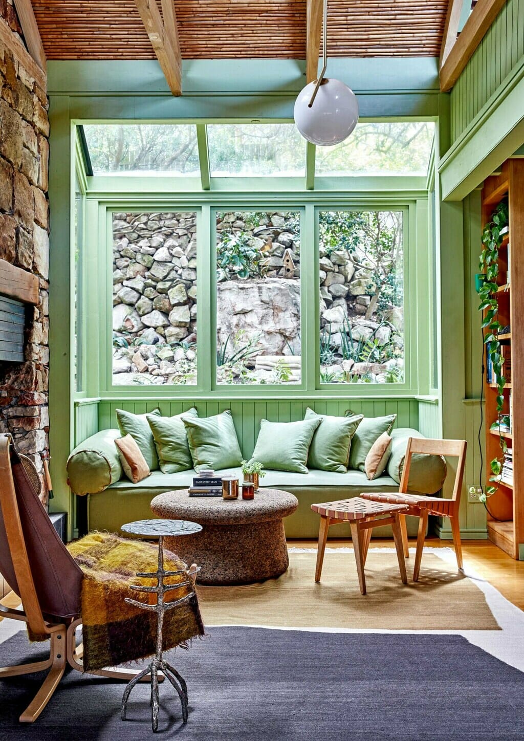
Enviably Green
The decision to paint all the walls and much of the ceiling of this heritage coastal holiday cottage in a single shade of green was one of the only changes made to the original home when its new owners took over, and was suggested by a friend who suggested the green would make the original yellow beechwood floors “look considered”. Not only did his prediction turn out to be accurate, the green also varies between hues of fern, olive and pistachio, depending on the light conditions as the day goes by.
Modern Hues
When decorating her mid-century modern home, a young fashion designer decided she wanted to use colours that were popular in the 1960s, which was when her house was built. “I researched what colours were popular [then] and chose the ones that I liked,” she says – shades that included the saturated pastels seen here in her living room – which she then combined with fearless verve to create a look that is both retro and fresh.
Production: Sven Alberding. Photography: Greg Cox/Bureaux, Warren Heath/Bureaux, Elsa Young/Bureaux.